
Recently i redesigned my blog. It was an enjoyable experience as i try to apply my new-acquired design theories learnt from tutsplus.com. My goal was to create an elegant and easy-to-read blog that represents myself both visually and content-wise. In this post, i will bring you through some of my design considerations for my blog.
A look behind the scene of my blog redesign
Define your brief
As with any projects, it’s important to figure what exactly you want to achieve and jot it down clearly. This can be a constant reminder as you progress through the design stages. At this point, we just need to figure out our ultimate goal without being worried about the details.
I wanted to design a blog that is simple to navigate on index page and contains easy-to-read blogposts across different devices. All of these pages should clearly define me and my thoughts.
Research and idea generation
Do some googling to get the creativity flowing. Inspirations can come from anywhere. Some of the best places i recommend to check out are:
As you go through these websites, grab a pen and sketchbook to jot down some of the things such as positions of blog elements, layout, colours, typefaces and navigation details commonly used. This will give you a basic idea of the contents to cover in designing your blog.
Design considerations
I wanted users to easily browse through my blog and focus on what i’ve written, so i’m not going to have too many ‘content’ pages such as about me, work, contact me etc. These side dishes are more for a portfolio page rather than a blog. In fact, i’m only going to have 2 main pages:
- Index page
- Content page
Based on my these ideas, it seems that i will need total control of designing my blog. I can’t afford to use ready made templates such as from Wordpress. Instead, i’m using a blog engine called Jekyll where i have the freedom to configure every element of my blog.
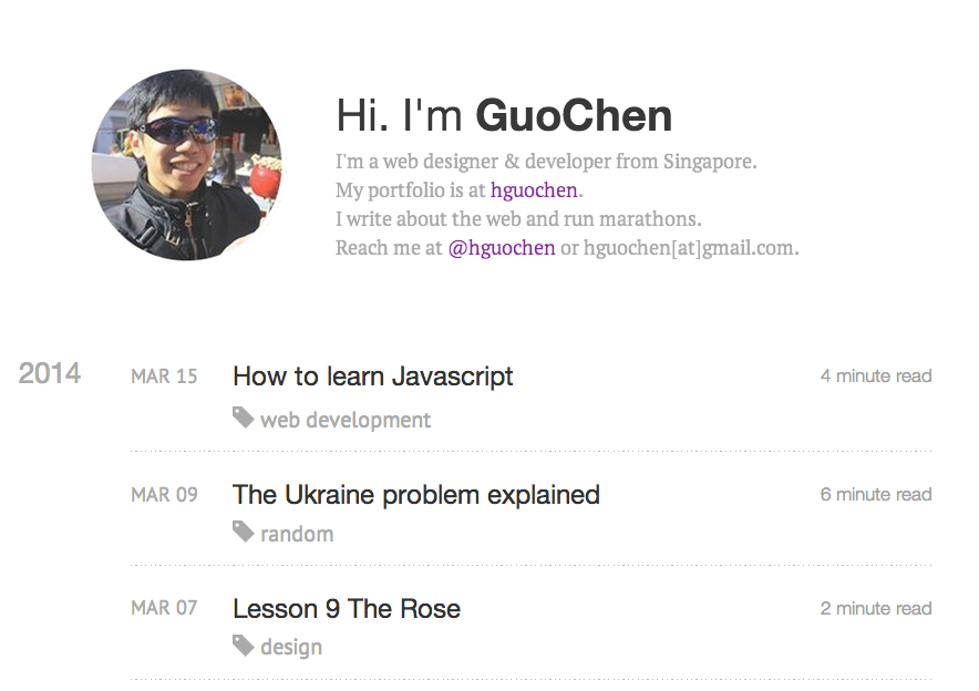
Index page
This will be the main page of the blog, which is also what greets users when they type in my blog url. Considering a typical user has a short attention-span of only 5 seconds on a webpage, i will need to present the entirety of my blog in that timeframe. Its good to give a short introduction of myself and the genre of this blog.

Next i need a way to quickly tell visitor what kind of topics i write about, and there’s no better way than allowing them to glance through my blog topics in a short scroll. Many blogs present their latest blogposts at the top. I think this is a bad practice as your latest blogpost might not necessarily be of visitors' interest. Sieving through your entire post to look at your other blogposts is just too much of a pain to get to know you. I’d advise against irritating your visitors.
With the year-annotated scrolling, my visitors will be able to quickly scroll through my list of blogposts and look for interests. We are providing a ‘simple to navigate’ index page, as part of our objective listed above.
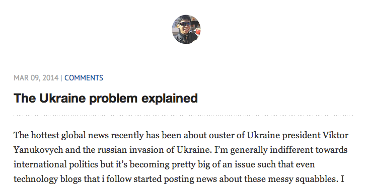
Content page
This is the meat of the blog. In fact, most visitors will be entering your blog through a blogspot than index page itself. It is important to establish some form of coherence between the content page and the index page. I chose to do it subtlely by appending my blog thumbnail picture at the top of the page. Followed by the date of the blogpost and topic.
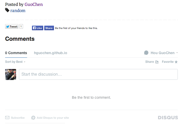
Footer of the blogpost should be dedicated to interactivity. If visitors has taken the time to read to the bottom, he/she most probably have enjoyed the post. It is good to elicit further action by either allowing the visitor to share on social domains or provide a comment for further discussion.
On Measure
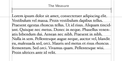
Measure, is the name given to the width of a body of type. There are several units of measurement used for defining the measure’s width. Three basic units are:
- One point = 1/72 of an inch
- One pic = 12 points
- One em = Distance horizontally equal to the type of size, in points. you are using. Eg. 1em of 12pt type is 12pt.
For a full width monitor, the optimum measure for reading is between 66-72 words a line. If you scale that down to a mobile screen, measure would come down to about 8-13 words a line.
On font-size
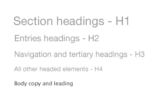
Appropriate font size will greatly enhance the readability of texts. I shall not go into detail here but some tried and tested font sizes for blog contents adopts the following pixel sizes:
- 16px - Body copy and leading
- 24px - Main heading & section headings
- 18px - Subheadings
- 13px - All other headed elements
This will give the following styles visually:
For the frontend designers, your CSS could look like this with the specifications above:
body {
    font: 16px/1.5em "Lucida Grande";
}

h1, h2, h3, h4, h5, h6 {
    font-family: helvetica, arial, verdana, sans-serif;
    font-weight: normal;
}

h1 {
    font-size: 218%;
}

h2 {
    font-size: 164%;
}

h3 {
    font-size: 145%;
}

h4 {
    font-size: 118%;
}
On typefaces
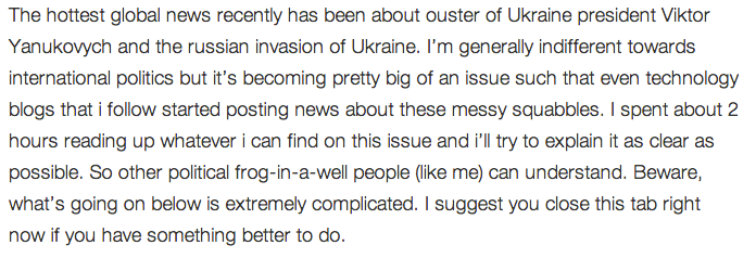
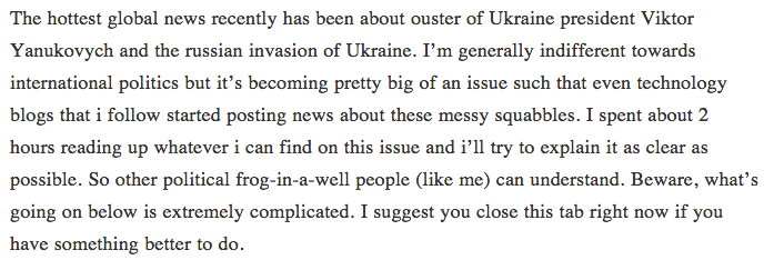
We read most easily with what we are most familiar with. This would mean the traditional serif family of typefaces. But even in the serif family, there are countless kinds of typefaces to choose from. On choosing a typeface, i’ve had a long trial and error on this. Here are 3 different serif types i’ve experimented with using on the same content:
 helvetica neue
Helvetica is a great font for texts, but it is not such a great typeface for continuous smooth reading. It lacks the ‘legs’ seen on other typefaces which provides the smooth gliding feel when reading on a screen.
 sans-serif
Serif is a safe font. Generally you won’t go wrong with this font. However, since i prefer a lighter shade of texts, i have to reduce the font-weight from normal 300 to 200. This didn’t fare well with serif typeface and words appear to thin to read properly.
 georgia
Part of the serif typeface family, georgia has always been a strong choice for continous texts. Some of the most popular web such as Medium and NyTimes uses georgia to render their texts. An additional advantage of georgia typeface is that it’s distinctive enough that font colors normally won’t erode its readability.
After weighing the considerations, i’ve decided to use ‘Helvetica Neue’ for headings and ‘georgia’ for paragraph texts. Here’s how it looks like:
On font color
Black text on white background offers the best readability. However, prolonged exposure on black contrasted texts could be painful to our eyes since modern screen brightness are getting better and better. As such, i’ve decided to reduce the contrast of texts by changing paragraph texts to a ‘greyier’ color while not compromising readability. After some trial and error, the color i’ve chosen is a grey with hexcode: #333332.

Responsive Design
The last of my consideration is to make sure my blog is readable on both mobile and desktop devices alike.
I like to use a grid because it provides a structural foundation, whiel making the development process easier and more efficient. Using a flexible grid enables a website to sclae dynamically to fit any device width. Below is the CSS for my responsive grid, which is my variations from bootstrap’s responsive grid.
/* 12 col responsive grid */

.row {
    clear: both;
    max-width: 1040px;
    margin: 0 auto;
}

[class^="col-"]:last-child {
    margin: 0;
}

[class^="col-"] {
    float: left;
    margin: 0 3.84615384615% 0 0;
    list-style: none;
    position: relative;
}


.col-xs-1 { width: 4.8076923077% }
.col-xs-2 { width: 13.4615384615% }
.col-xs-3 { width: 22.1153846154% }
.col-xs-4 { width: 30.7692307692% }
.col-xs-5 { width: 39.4230769231% }
.col-xs-6 { width: 48.0769230769% }
.col-xs-7 { width: 56.7307692308% }
.col-xs-8 { width: 65.3846153846% }
.col-xs-9 { width: 74.0384615385% }
.col-xs-10 { width: 82.6923076923% }
.col-xs-11 { width: 91.3461538462% }
.col-xs-12 { width: 100%; margin: 0 }
My breakpoints for my responsive blog are:
- 360px max-width for mobile
- 768px max-width for tablets
- 1024px max-width for desktops
Keep in mind that with a growing array of devices, there is no longer a ‘common’ width concepts. It is best to optimize for whichever devices you intend to serve.
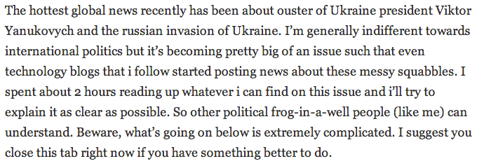
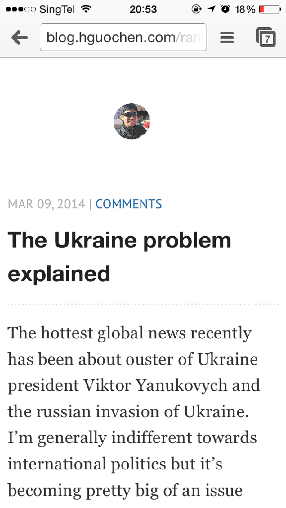
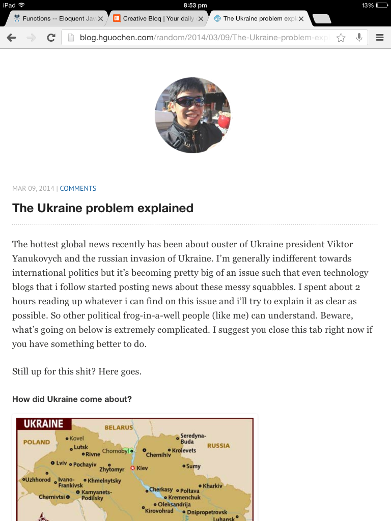
Here’s my blog’s responsive layout on a few devices:
iPhone 5
iPad Mini
Desktop
So, i’ve designed and tested out my new blog layout. It is my first time designing a blog from scratch and i’ve really learnt alot in the process! Designing is like a constant war between your left brain and right brain while still trying to grip on to established design principles. ROAR! But still, it is fun :) Hopefully my experience has provided you with a guideline to designing blogs. I’d love to hear about your experiences in designing your own blog!