
A recent side project of mine, Beebeta, is about to launch its MVP. I was involved in both the frontend and backend engineering of Beebeta. Check out Beebeta’s stack at Beebeta Engineering.
Being new to the world of frontend designing, i’m not sure if my design would be used eventually. But still, i would like to share my frontend design experience and concepts in this post. Partly to document my design journey but more importantly, encourage other programmers(like me) to pick up web designing in their free time.
What is Beebeta?
Search engines are vast, and non-targeted. While you will definitely be able to find valuable facts and informations on topics, it is not built to reflect the public’s opinions on questions at hand. That’s what Beebeta is for. It gives you insights to what the crowd thinks about an issue. Which could be questions as trivial as ‘Which restaurant serves the best Ramen?’ or global issues such as ‘Should gay marriage be allowed?’.
Design Goal
With the above concept, it is evident that Beebeta is all about polling the public with questions. We are going to implement this by asking users questions and offer pre-determined choices for voting. Users may also add additional choices if they like. Here are a few design goals i’ve charted out:
- Questions are the prime content of the website
- All visual elements should contribute to better contents
- User’s Call To Action(CTA) is voting and should be encouraged visually
- Page should be simple and minimalistic
Research and idea generation
Do some googling to get the creativity juices flowing. These are some of the places i checkout to brainstorm design ideas:
I usually grab a pencil and sketchbook to jot down some of the things such as essential page elements, layout, colors, typefaces and navigation details. Sometimes i feel particularly artistic and try to draw…
Ok fine i admit calling it ‘drawing’ is an overstatement. Very-very crude mockups.
Design
All my page designs start from mockups. From grid layout, to box structure and eventually down to individual elements. For each step of this process, i pay attention to how elements in question interacts with each other and establish cohesiveness.
Grid Layout
I adopted the 12-grid system for Bootstrap 3. Boostrap 3 is designed ‘mobile first’. It’s newly renovated grid system caters to a whole array of digital devices from mobile phone to high resolution desktops. A nice tutorial about the new grid system for Bootstrap is found here.
I used the following grid dimensions:
/* 12 col responsive grid */

.row {
    clear: both;
    max-width: 1040px;
    margin: 0 auto;
}

[class^="col-"]:last-child {
    margin: 0;
}

[class^="col-"] {
    float: left;
    margin: 0 3.84615384615% 0 0;
    list-style: none;
    position: relative;
}


.col-xs-1 { width: 4.8076923077% }
.col-xs-2 { width: 13.4615384615% }
.col-xs-3 { width: 22.1153846154% }
.col-xs-4 { width: 30.7692307692% }
.col-xs-5 { width: 39.4230769231% }
.col-xs-6 { width: 48.0769230769% }
.col-xs-7 { width: 56.7307692308% }
.col-xs-8 { width: 65.3846153846% }
.col-xs-9 { width: 74.0384615385% }
.col-xs-10 { width: 82.6923076923% }
.col-xs-11 { width: 91.3461538462% }
.col-xs-12 { width: 100%; margin: 0 }
Typeface
I think typeface of a website determines the longevity and pleasure of browsing its contents. Good typefaces gives readability and allows you to focus on the content. For beebeta, i used serif typeface for block headers and helvetica neue for body texts. These are generally pretty safe typefaces for websites.

The Beebeta typeface in the icon is given to me pre-designed as OratorStd.
Colour
I used 3 colors as the theme of Beebeta. 2 triad colors, #4288CA(Celestial Blue) & #5CB85C(Fern) and 1 neutral color #F0F0F0(Beige Grey).
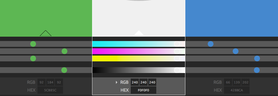
Fern green is used for navigational contents and Call To Action(CTA) activites users performs.
Netural color Beige Grey will make the base color of the site. This effectively allows focus on contents without too much ‘noise’ from the background.
Celestial Blue are used as cordoned containers for user details and personal spaces within the site.
Effectively the site is just a mix and match of these 3 simple colours.
Navigation
Navigation determines the usability of the site. For our Minimum Viable Product(MVP), which has limited features, i want users to understand the purpose of the website at a glance through navigational bar without having it competing for user attention from the contents. Since posting questions is fundamental to the site. It should have a visual focus primarily, with user utility functions available nearby. Here is how it looks:


Header
I wanted a simple header without any unnecessary contents. It should be so painfully simple that it looks almost undesigned at all. I think the benefits of a bare-bone header drives clarity. That users don’t derive too much assumptions of the contents of the website based on header. It invites users browse to find out more. Here’s how it looks like:

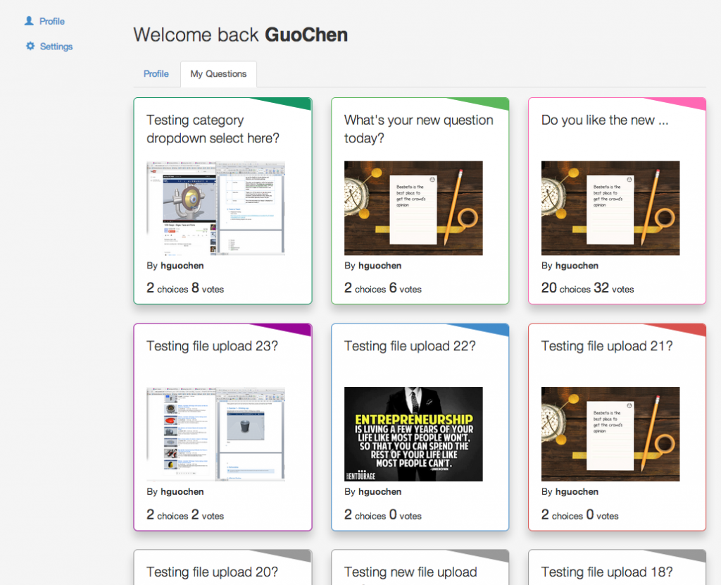
I am experimenting with color-coding of question categories here. Each category is assigned a colour. My aim is to promote category classifications so users sub-consciously associate a colour to a category. I’m guessing this will contribute to an easier browsing experience over time.
Question Card
Question card is the main content. It is what beebeta is all about. My design concept for questions takes the form of ‘question cards’. Each poll question is a unique question card served.
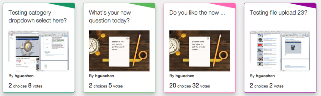
In order to synchronise the color-coding category concept earlier, i added a subtle colour border for each question card of its associated category. The question card displays the question text, user uploaded image, uploader’s name, number of choices and number of votes received so far.
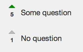
Voting
I adopted the classic reddit style voting which allows users to vote up a choice and provide a visual feedback with updated vote count and fern green arrow up button.
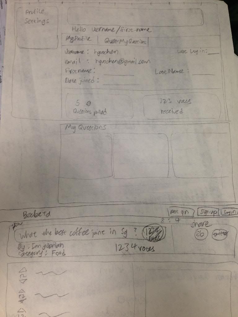
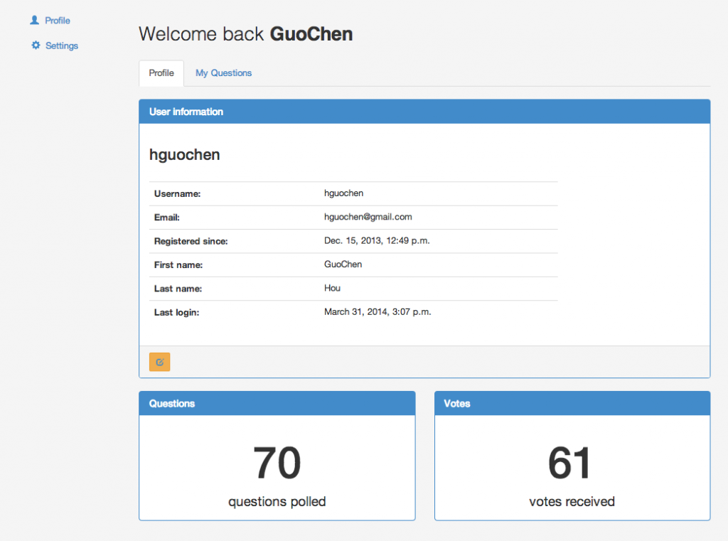
Profile page
As an extension of the ‘question card’ concept, i gave a similar box style to profile page. Users have 3 profile boxes which is unique to them, namely User Information, Questions and Votes counts.
The following tab, My questions, allows users to view and edit his posted questions.
Footer
I’ve choosen flat white for footer, which colour synchronises with the header. Again, i’m experimenting with using lighter colours as opposed to heavy colors for headers and footers.

So that’s it folks! If you think that this design is really basic, you are right! I do agree that there are alot more to be done with the design of a polling site like Beebeta. I would like to hear your comments and suggestions on how i can improve my design. Peace out! :)