
The Situation
The Standard Chartered Marathon Singapore has been around for years and has always been hailed as the golden running event of Singapore. However, for an event with such fame and recognition, its website www.marathonsingapore.com is just really ugly and site navigation is nothing less than complete frustration. The frontpage looks cluttered without any form of information hierarchy. Contents are hidden among a sphagetti of flashy colours. On searching for information, i have to actually resort to googling about the site instead of navigating the site itself. I consider that a failure in content design.
Ok let’s be systematic about its shortcomings. Here are the problems i have identified on the current site design:
- Page styles that can be rendered with HTML/CSS are instead done with raw jpg images. Looks like optimization concerns was thrown right out the building from the start.
- A simple inspect element reveals a total of 8 colors used for the frontpage. Some of these colors are neither analogous nor complementary to each other. The resulting visual distraction is appalling.
- Call to Action(CTA) buttons are hidden among less relevant contents.
- Content flow on page are non-hierarchical.
- Site navigation bar are cluttered and information meta-data is a mess.
- Date, Time & Place(DTP) are non obvious at a glance.
- Lack of sitemap to aid user navigation.
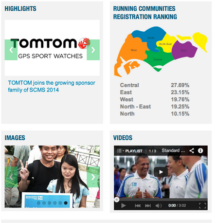
- Teaser box contents are prefixed with useless meta-info such as Images, Videos, Highlights etc.
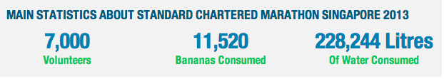
- For a running event, statistics banner information are totally irrelevant. Would the public seriously care about how many bananas or amount of water consumed in a race held last year? Since i’m not your logistics officer, i would be more interested in learning how many runners participated in each category don’t you think?
My Task
With the problems identified, my job scope is pretty clear from now on. Here are my design objectives:
- Re-introduce a color theme to the site such that it puts the focus on the content.
- Organize the navigation bar that correctly depicts the meta-datas.
- Collate a sitemap to be appended to the footer for easier site navigation.
- Use visual cues to bring out the importance of CTAs.
- Redesign teaser boxes as an entry point to the site’s content.
Action
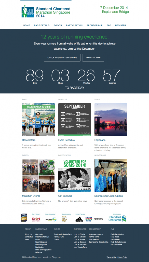
Logo and navigation bar
Race date, time and venue are probably the 3 most important piece of information for a running event. So we are going to place them right where visitors first sees when visiting our page.
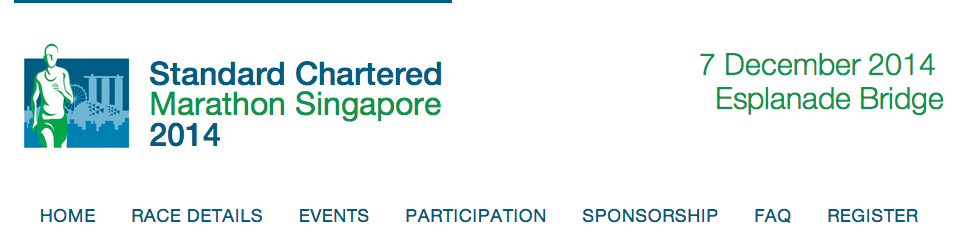
Since there are many race categories for Standard Chartered Marathon, the start times for different races are staggered. In this case, to prevent confusion, we obscure time information from the banner and present them in the event schedule instead.
Navigation bar is restructured and renamed to correctly identify relevant meta-datas. Some of the less relevant information such as ‘2013 results’ are demoted from this piece of expensive real estate.
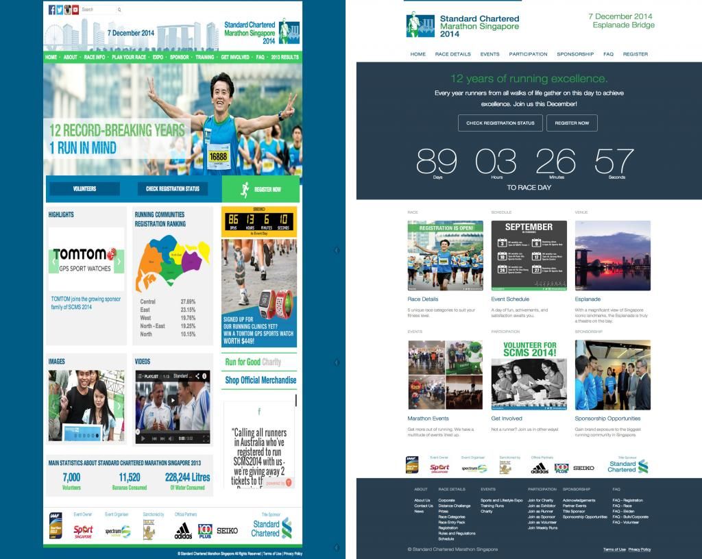
Before:

After:

Carousel section
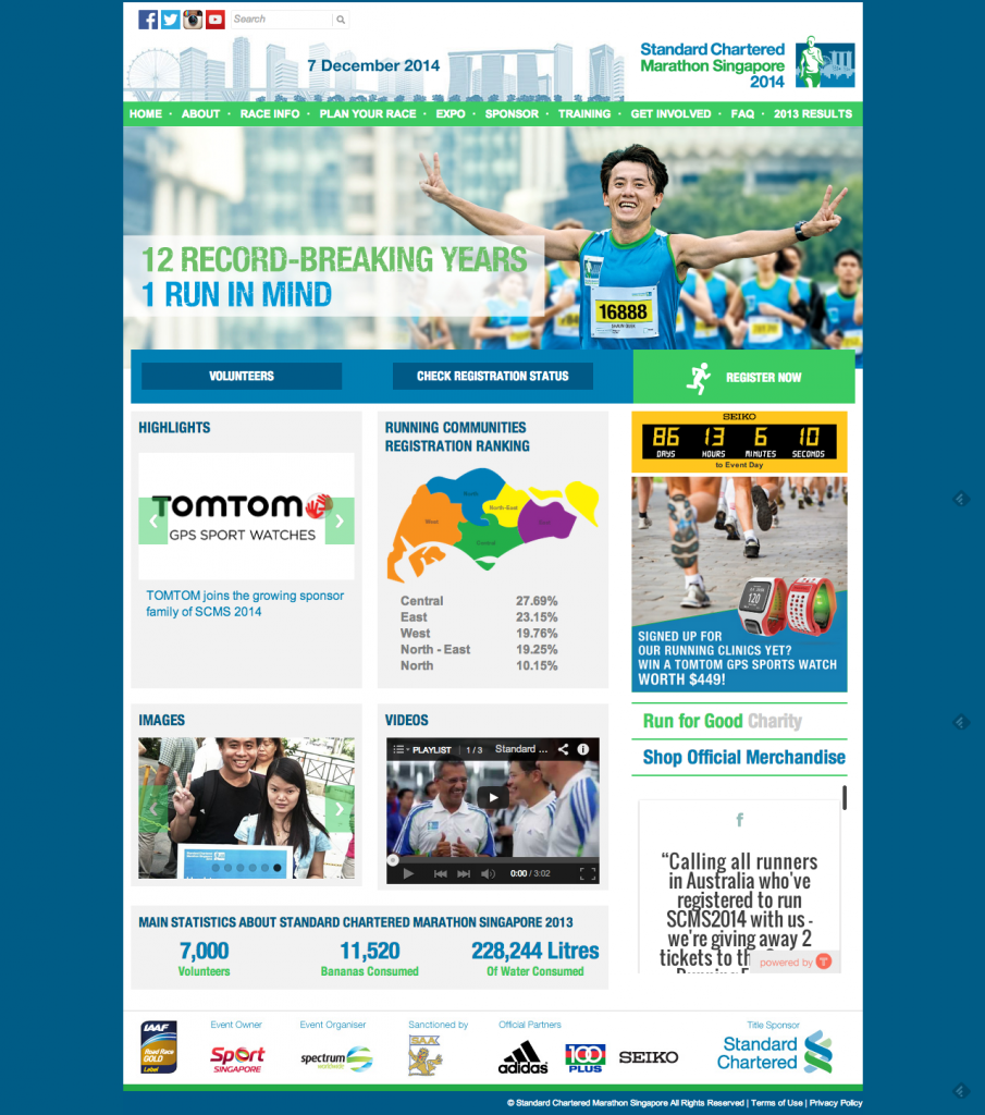
Before:

After:
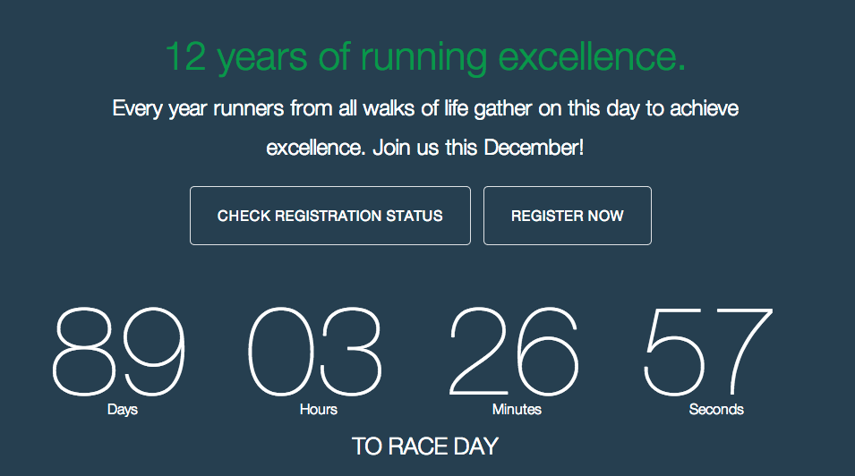
The current carousel section had a bad choice of picture. This contributes to obscuring the importance of CTAs. Instead of choosing pictures, we are going to completely remove pictures as part of carousel theme and introduce a reasonable tagline to supplement the website’s agenda.
Clear CTAs sits just below the tagline to guide users on the appropriate course of action.
The countdown to race day is a pretty good idea, but it was previously obscured in the right corner of the page. I redesigned and moved the countdown timer to dead center.
Teaser boxes
Before:
After:
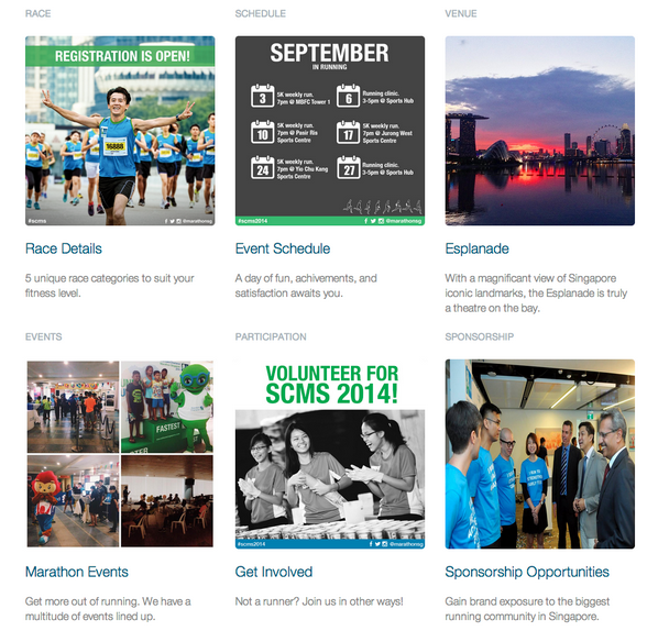
The existing teaser section didn’t make sense to me. What does ‘IMAGES’ and ‘VIDEOS’ section header tell you? I re-worked this section completely to reflect the content groupings of the website. These teasers will serve as entry point to its respective array of contents.
Footer and sitemap
Before:

After:
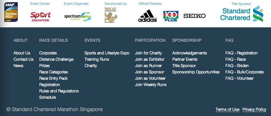
For easier site navigation, i’ve added a simple footer that allows users to view the content headers at a glance.
Result
The static page is hosted HERE if you would like to inspect elements and dabble with my design. Otherwise, for the geeks out there, this project also sits on my github repository. Let me know what you think about my redesign and leave in the comments below!